web: experiment with viewport and columns
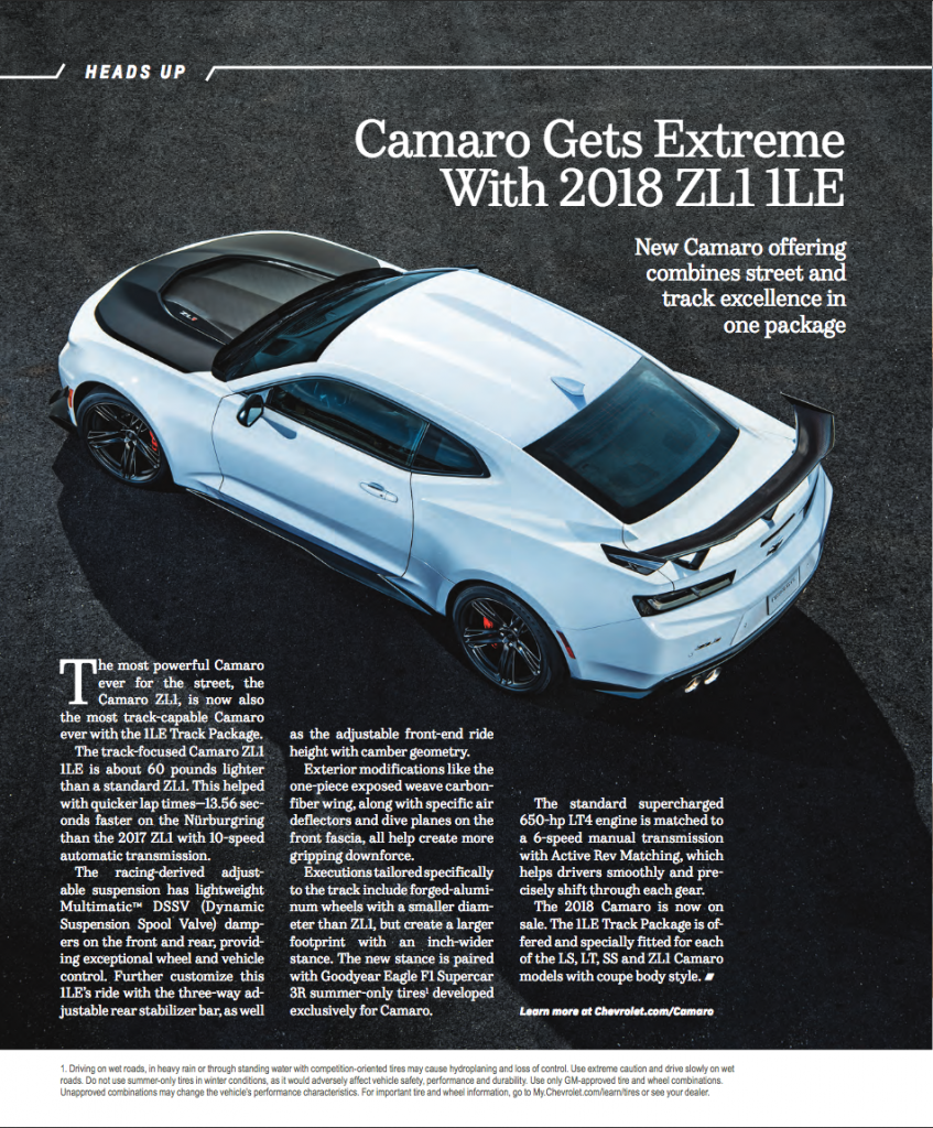
The inspiration page features a background image, a section heading on top, and headings that are right aligned. The text is in 3 columns aligned on the bottom of the page and has a learn more link. The bottom of the page has a white background with legal text.
The web page result is responsive, so the number of columns is dependent on the width of the screen.
View the html page at http://sullivanlehdesigns.com/play-examples/camaro-layout.html. Resize the browser to see the effect screen width has on the layout.
Testing:
- viewport sizing
- css columns


I was curious if the columns could wrap around the shape of the car like the print version. This isn’t currently possible without forcing the text into explicit columns, and it was more important to me that the text flow between columns based on screen size so it remains legible.